What a High-Performing Website Looks Like in the Age of AI
By Brady Lewis
Originally Published
Earlier this year, my colleagues and I joined a virtual call with a web development firm and asked what it would cost to build us a modern site. The person on the other end of the call did not hesitate. "Our projects start at one hundred thousand dollars."
That was the good meeting. Most firms we reached out to would not even take the call. The ones that did opened with a number that would have consumed a serious chunk of a fifteen-person agency's budget, for a website. And here is the part that stuck with me. While they were quoting me six figures, I kept thinking about what they were actually proposing to build. It was a nicer version of the thing we already had. A prettier brochure.
Somewhere in that call, I did the math, and I raised my hand. I told our president, Deb Andrews, that I would build it. I have been building websites since 1994, and we could save the hundred grand. More importantly, I could make sure it was built for what a website has to be now, not what one used to be.
That distinction is the whole point of this piece. Because the reason that quote felt absurd was not just the price. It was that the definition of a high-performing website changed underneath most of us, and a lot of companies are still paying premium money to build the old thing well.
The website we were escaping
Let me set the scene, because your company might be living in it.
Marketri’s old website ran on WordPress, and over time, it had become weighed down by plugins, slow load times, and a backend that made even simple updates more complicated than they needed to be. The site still functioned, but maintaining it required too much time, effort, and technical overhead. Every change came with friction, and that friction was holding us back.
Every content update meant calling our development company. And the meter started at five hundred dollars. Want to fix a typo on a service page, swap a headline, add a new template? Five hundred dollars, minimum, and a wait. Think about what that does to a marketing team. It does not just cost money. It kills momentum. You stop improving the site because improving it hurts. The website becomes a thing you tolerate instead of a thing you use.
That is where most mid-market B2B companies actually are. Not with a broken website. With a website that is expensive to touch, slow to load, and built for a version of the internet that no longer exists.
So, when Deb decided we needed a full rebrand and a site to match, the question was not "how do we make the brochure nicer." It was "what does a website even need to be in 2026, and how do we build that."
Three things a website has to be now
Here is the shift most people have not fully absorbed. For twenty years, a business website had one job: look credible to a human who typed your name into Google and clicked through. Get the branding right, keep it reasonably current, and you were fine.
That job description is gone. A high-performing website now has to do three things it did not used to have to do. Miss any one of them and the site underperforms, no matter how good it looks.
One. It has to be genuinely fast. Not "fine on your office wifi" fast. Measurably, provably fast, on a phone, on a slow connection, from a cold start. Speed used to be a technical nicety that developers cared about and executives ignored. It is now a business metric. Google's Core Web Vitals bake load speed and responsiveness directly into how you rank. Human beings bounce off a slow page before they read a word of your carefully written value proposition. And the AI systems now crawling and summarizing the web reward pages they can render and parse quickly and cleanly. Slow is not just annoying anymore. Slow is invisible.
Two. It has to be legible to machines, not just people. This is the one that sneaks up on B2B leaders. Your buyers are increasingly not starting on Google at all. G2 surveyed more than a thousand B2B software buyers this spring and found that 51 percent now begin their research with an AI chatbot more often than with a search engine. A year earlier that number was 29 percent. That is not a trend. That is a stampede. And the same study found that 69 percent of buyers ended up choosing a different vendor than they originally planned based on what the AI told them.
Sit with that. Half your prospective buyers are asking Claude or ChatGPT or Perplexity about your category before they ever see your homepage. If those systems cannot read, understand, and confidently cite your site, you are not in the conversation. This is the discipline people are calling answer engine optimization and generative engine optimization, AEO and GEO, and it sits right alongside traditional SEO now. It is not a replacement. It is a second audience. Your website has to perform for the human reader and for the machine that is summarizing you to the human reader. Those are different jobs, and the second one is new.
Three. It has to be part of how you operate, not a billboard beside it. The old model treated the website as a destination. A place you sent people. A digital business card that sat off to the side of the actual company. That is the brochure mentality, and it is why the WordPress-plus-a-dev-shop arrangement felt normal for so long. The brochure does not need to talk to anything. It just needs to look nice and get reprinted occasionally.
A high-performing site today is wired into the rest of the business. For us, that means the website connects into the wider system we run at Marketri: our internal apps, our automation layer, our data layer, and the agentic tools we have built on top of all of it. Content flows in and out of it programmatically. Our team can publish and update without filing a ticket and waiting three days. The site is a working part of the operation, closer to the front desk and the switchboard than the billboard out front. When people talk about a company's digital ecosystem, this is the real version of it: the website as one connected node, not a lonely island.
Fast. Legible to machines. Connected to how you actually work. Those are the table stakes now. A site can be beautiful and fail all three, which is exactly what a lot of expensive rebuilds deliver.
The tech stack that gets you there
You do not get those three things by accident, and you usually do not get them from a traditional page builder bolted onto WordPress. You get them from an architecture designed for them.
We chose Next.js for the front end and Sanity as the content management system. In plain terms: Next.js is what makes the site fast and machine-friendly at a structural level, and Sanity is what lets a non-technical marketer manage the words and images without ever touching code or calling a developer. That combination directly attacks the two problems that defined our old site. The performance ceiling and the five-hundred-dollars-to-fix-a-typo tax.
Before any of that, we did the part too many companies skip or rush. We brought in an experienced designer to rebuild the brand from the studs. New colors, new logo, new type, a full visual system, and the design for every page. He delivered all of it in Figma. That handoff, a clean set of design files, is where my job started. I had to turn a static design into a living, fast, connected website.
That is when things got interesting.
What the build actually taught me
I want to be honest about the messy middle, because the clean version of this story is a lie, and the messy version is where the real lessons live.
I did the entire build working with Claude Code as my development partner. Not as a novelty. As the actual engine of execution. I even built two custom plugins for it ahead of time, one loaded with skills for turning Figma designs into Next.js, and one for working with Sanity, so the AI came to the project already fluent in exactly what we were doing.
My first plan was elegant. Connect Claude directly to the Figma design through an integration, let it read the design data natively, and build from there. The reality was less elegant. I hit a wall of permissions issues that took real time to solve, and the fix was almost comically low-tech: I copied the whole design into my own Figma account and connected to that.
Then came the lesson I keep thinking about. Once Claude could read the file, it looked like it was pulling everything over perfectly. I ran it through a thorough checklist of every design element it needed. On paper, flawless. But when it started building actual pages, the design came out wrong. Elements out of place. Old colors bleeding in. Styles that did not belong.
Here is what was happening. The Figma file, like almost every real design file, was full of hidden layers. Old iterations. Abandoned color options. Duplicated pages that nobody had bothered to rename. To a human designer, that clutter is invisible. It does not affect what you see. But the AI did not know the difference between what was live and what was left over. It faithfully carried all of it over, junk included, and even got confused by the pages that were named "Copy of Copy of Homepage."
That is a preview of a problem every company is about to face. AI does not clean up after you. It reflects your inputs back with perfect, indiscriminate fidelity. Messy design files, messy documentation, messy data. The mess does not stay quietly in the corner anymore. It shows up in the output. Designers, and honestly all of us, are going to have to get much better at keeping our source material clean, because AI tools now read the whole thing, not just the parts we meant for them to see.
So, I switched tactics, back to a method as old as web design itself. I exported every page of the Figma design as a plain screenshot and had Claude rebuild the themes and pages from the images. No hidden layers in a screenshot. Just the design as the eye sees it. That single move got us about 95 percent of the way there on the visual side.
Where AI stopped being a tool and started being the team
Once the design held together, the pace of everything changed, and this is where the economics of the whole project turned upside down.
Integrating Sanity into every page so our team could manage content themselves? Claude got that almost entirely right on the first pass. A few tweaks to how the navigation menus were configured, and it was done.
Then the big one. We had more than four hundred blog posts sitting in the old WordPress site, years of content and SEO equity that we could not afford to lose. Migrating that is the kind of project that traditionally eats weeks and invites disaster. At Claude's own suggestion, we set up a staging environment in Sanity first. Then it went to work. It studied our WordPress configuration through the API, worked out how to move the content in a way that preserved our search rankings, mapped out every redirect we would need, even noticed a plugin we were using to manage redirects and captured all of those so no link would break. It wrote the migration scripts, ran them into staging, tested what landed, adjusted, ran again, tested again. When I gave the thumbs up, it pushed all four hundred-plus posts into production.
Start to finish, about two hours.
Then several of our team members went through the entire site for quality assurance. The feedback was almost all cosmetic. Match this gradient better. Tighten this layout. Nothing structural. Nothing broken.
We officially launched the new site on July 8th, 2026. No drama. It just went live.
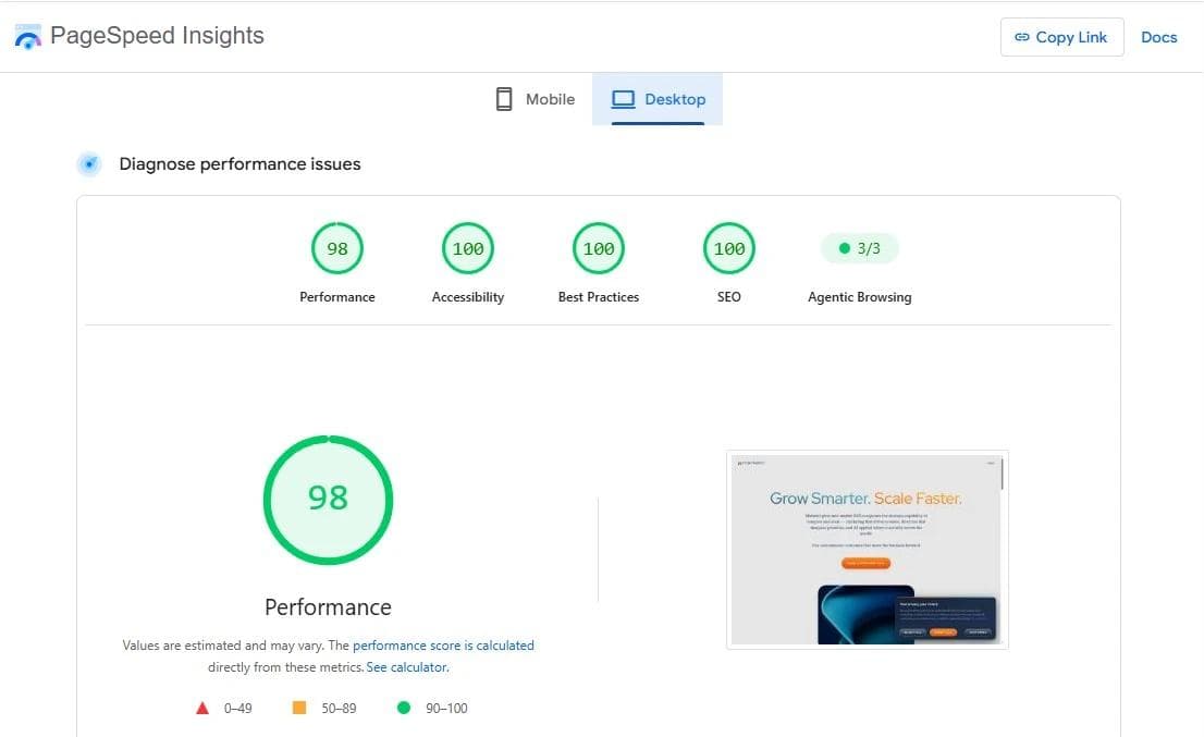
The morning after launch, I ran our PageSpeed scores. Performance came in at 49, accessibility 95, best practices 73, SEO a perfect 100, and 3 out of 3 on agentic browsing, which is the measure of how well AI agents can actually use the site. For a site one day old, that is a strong start. But 49 on performance was not going to sit right with me.
I went back to Claude Code. It ran the PageSpeed analysis itself and built a phased plan to fix everything the report flagged: GDPR compliance, Google Tag Manager issues, stricter security headers, and a long list of smaller items. One afternoon of working through that plan took performance from 49 to 71. I kept going. By the evening of the third day, our scores were maxed out across the board.
Three weeks of build once we had the design files. A month all in, while I also ran my other responsibilities. One person and an AI, doing what a firm quoted at six figures and called a starting price.
The part nobody quotes you $100k for anymore
I want to be careful here, because the wrong lesson is easy to grab.
The wrong lesson is "AI builds websites for free now, fire your web team." That is not what happened, and if you try it that way you will get a very fast, very cheap disaster. Here is the nuance that actually matters.
AI collapsed the cost of execution. It did not collapse the value of judgment. Every good decision on this project came from experience the AI does not have. Knowing that Next.js and Sanity were the right stack for our specific goals. Recognizing why the design was coming out wrong and diagnosing the hidden-layers problem. Knowing to stage the migration before touching production. Knowing that a 49 performance score was worth three days of my time to fix. I have twenty-five years of building behind me, and I spent every bit of it directing the AI. Take a person with no web experience, hand them the same tools, and they would not have known what to ask for, let alone whether the answers were right.
And the designer mattered. The brand mattered. The human quality assurance mattered. AI did not replace any of that. It removed the drudgery between a good decision and a shipped result. The typing, the boilerplate, the migration scripts, the endless configuration. The stuff that used to justify the hundred-thousand-dollar quote and the three-day wait for a typo fix.
That is the real transformation, and it is bigger than one website. The cost, the headcount, and the calendar that used to gate this kind of work have been rewritten. A small team that knows what it is doing can now build at a level that used to require a big budget and a specialized firm. I have said for years that small teams with the right systems beat big teams with the wrong ones. This is that belief, proven on our own front door.
One more piece, because it closes the loop. I have since connected Claude directly to our Sanity CMS. I can now research and write content inside Claude and push it live to the site without leaving the conversation. The website is not a place I go to update anymore. It is wired into how I work. That is the connected part of the three, made real.
Look at your own site
Here is the honest question to sit with. Not "does our website look dated." Looks are the easy part and the cheapest to fix.
Ask instead: Is our site fast enough that a buyer on a phone never waits? When someone asks an AI about our category, does it know we exist and describe us correctly? And is our website actually part of how we operate, or is it a brochure we pay a toll to change?
If the answer to any of those is shaky, the problem is not that you need a prettier site. It is that "high-performing" means something different now than it did when your current site was built, and the gap is quietly costing you buyers you never see.
You do not need a hundred-thousand-dollar quote to close that gap.
You need the right architecture, a clear head about what a website is for now, and a willingness to use the tools that changed the math. That is exactly the kind of work we are helping our clients think through at Marketri, because we just lived every part of it ourselves.
Your website is either keeping up with what the web has become, or it is a nice-looking billboard. Go find out which.